ShopDreamUp AI ArtDreamUp
Deviation Actions
SPECIAL GUEST STAR (against his knowledge) IS 
You guys know when I get really excited about art geekery, I JUST CAN'T KEEP IT IN. I also feel like composition is a really hard thing to learn, and all you can really do is try to learn "what is good" in composition, and then try to find examples until you can recognize it. In addition, composition for comics is extra hard because you have to worry about the overall flow of the page as well as the composition of each individual panel.
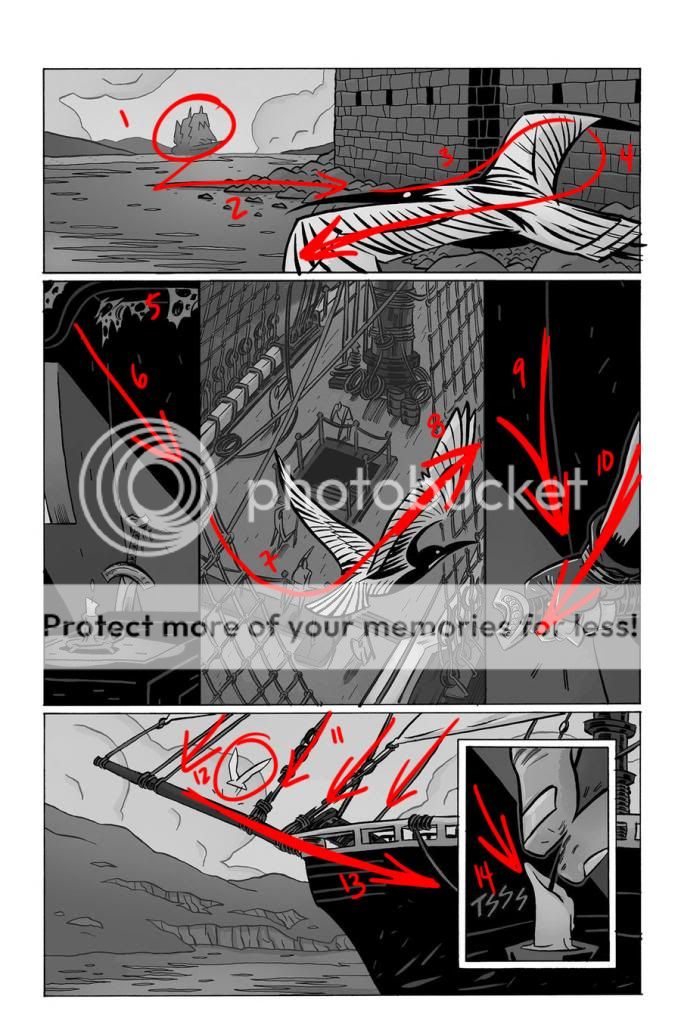
So I was doing my spring cleaning of my message center and came on some new comic pages he uploaded, all of which are awesome, but take a particular look at this one:
This page is AMAZING. I started watching this guy for his slick style and stayed for his crazy composition skills, and this page makes a particularly good example because his work is so clean and straight-forward, there's not a lot of noodling to distract from the motion lines.

1- We read left to right (thanks to MikeMoroney for pointing out my idiot type-o there,) and then up to down, so we start in the upper righthand corner here. The hills shoot us right into that ship, tallest thing on the horizon, first focal point.
2- Little rock trail creates a path for us to go between the sea (extreme background) to the castle, (middle ground), and then the line of the bird picks it right up.
3- Line of the beak and back of the bird, up and around that wing with the considerate curved negative space behind the back wing. Also, the bird is flying right>left, if it were the other way around, our natural inclination would be to follow it right off the page.
4- Strong diagonal is the main shape of the bird. Shoots your eye right down to the second row.
5- Here's where it gets sexy. Little moments of low-contrast details keep your eye interested and get you right into that upper left-hand corner again, where
6- Sharp diagonal line directs you into the next panel. Shadow lying scientifically impossibly on the two walls that make a corner? Doesn't matter if no-one questions it because it looks so right. Also worth mentioning that ll the lines of the walls and windows in panel 2 are slightly warped to the right to help keep us going forward.
7- Line is continued in the netting, again, low contrast and interesting detail as opposed to strong contrast which would indicate important content like in
8- Back with the bird, amazing action line up and over.
9- Line of wall and line of shadow funnel energy into that sword grip. THAT'S A GRIP.
10- Contrast of the light arm provides the direction. Once again, down and over. Panels at the end of a line can't keep going off to the right- that just falls off the page and takes you out of the flow.
11- All the rope lines continue that trajectory. They're only unparallel for the sake of interest. As with the cobwebs in 5, and the netting in 6, he's using repetitive objects to guide your eye and provide interest but at the same time demonstrating it's not something you really need to spend a lot of time with.
12- BIRD. It's literally an arrow in the direction your eye is moving.
13- Prow (or whatever) hijacks the flow, reinforced by the hills and the negative shape of sky.
14- Simple diagonal shadow line like in panels 2&4 showing you where to go. That finger has just come DOWN on that wick.
That's just the first pass look. Obviously, you have to stray from this path to see a lot of what's going on, but if you feel like taking the time and looking at all the details, you'll find his page still works on every level. For instance, on panel two, you need to get down to that sword and candle. If you do so, you'll follow those warped window and wall lines down, where the sword stops you, and redirects you to the candle on the table. Then that horizontal patch of light that it's in, and the up-and-to-the-right markings on the table guide you right into that netting on panel 3. So hot.
You guys know when I get really excited about art geekery, I JUST CAN'T KEEP IT IN. I also feel like composition is a really hard thing to learn, and all you can really do is try to learn "what is good" in composition, and then try to find examples until you can recognize it. In addition, composition for comics is extra hard because you have to worry about the overall flow of the page as well as the composition of each individual panel.
So I was doing my spring cleaning of my message center and came on some new comic pages he uploaded, all of which are awesome, but take a particular look at this one:

This page is AMAZING. I started watching this guy for his slick style and stayed for his crazy composition skills, and this page makes a particularly good example because his work is so clean and straight-forward, there's not a lot of noodling to distract from the motion lines.

1- We read left to right (thanks to MikeMoroney for pointing out my idiot type-o there,) and then up to down, so we start in the upper righthand corner here. The hills shoot us right into that ship, tallest thing on the horizon, first focal point.
2- Little rock trail creates a path for us to go between the sea (extreme background) to the castle, (middle ground), and then the line of the bird picks it right up.
3- Line of the beak and back of the bird, up and around that wing with the considerate curved negative space behind the back wing. Also, the bird is flying right>left, if it were the other way around, our natural inclination would be to follow it right off the page.
4- Strong diagonal is the main shape of the bird. Shoots your eye right down to the second row.
5- Here's where it gets sexy. Little moments of low-contrast details keep your eye interested and get you right into that upper left-hand corner again, where
6- Sharp diagonal line directs you into the next panel. Shadow lying scientifically impossibly on the two walls that make a corner? Doesn't matter if no-one questions it because it looks so right. Also worth mentioning that ll the lines of the walls and windows in panel 2 are slightly warped to the right to help keep us going forward.
7- Line is continued in the netting, again, low contrast and interesting detail as opposed to strong contrast which would indicate important content like in
8- Back with the bird, amazing action line up and over.
9- Line of wall and line of shadow funnel energy into that sword grip. THAT'S A GRIP.
10- Contrast of the light arm provides the direction. Once again, down and over. Panels at the end of a line can't keep going off to the right- that just falls off the page and takes you out of the flow.
11- All the rope lines continue that trajectory. They're only unparallel for the sake of interest. As with the cobwebs in 5, and the netting in 6, he's using repetitive objects to guide your eye and provide interest but at the same time demonstrating it's not something you really need to spend a lot of time with.
12- BIRD. It's literally an arrow in the direction your eye is moving.
13- Prow (or whatever) hijacks the flow, reinforced by the hills and the negative shape of sky.
14- Simple diagonal shadow line like in panels 2&4 showing you where to go. That finger has just come DOWN on that wick.
That's just the first pass look. Obviously, you have to stray from this path to see a lot of what's going on, but if you feel like taking the time and looking at all the details, you'll find his page still works on every level. For instance, on panel two, you need to get down to that sword and candle. If you do so, you'll follow those warped window and wall lines down, where the sword stops you, and redirects you to the candle on the table. Then that horizontal patch of light that it's in, and the up-and-to-the-right markings on the table guide you right into that netting on panel 3. So hot.
Teaching in Boston
Hey All! As some of you know, I've been tutoring via skype for some time, but this winter I'm expanding into the REAL LIVE WORLD of teaching classes! For the month of December, I'll be doing a trial and seeing if this is a tenable arrangement, so I get to teach WHATEVER THE HECK I FEEL LIKE.
So I wanted to A) let those among you who are Bostonians know this was going on, and B) ask you for feedback. What classes would you be most interested in taking? Have you taught/attended independent arts classes before and you have suggestions or anything? What days/times would you be most likely to go to? All RIGHT!
P.S. this IS connected to the
DA's Commissions Shop
So this is a thing! http://www.deviantart.com/commissions/
So. Your friendly neighborhood Auntie Toerning is going to step in for a second here. Firstly, I think it's very groovy and awesome that DA is establishing their own marketplace. It's a scary world out there of work for hire and it's totally awesome that DA artists now have this stepping stool to practice professional habits in the same way that we practice artistic skills!
A
BIG
FAT
HOWEVER
I would like to take a moment to discuss the rates here. I was just exploring quickly, and saw on the navigation on the left "price," and, like every other human on the planet, clicked
Shared Studio Spaces
This is something I've been thinking a lot about. The fact of the matter is, as much as it's awesome, I don't work my best from home. I want to be able to "go to work" in the morning, see people, do my thing, and then come home. There are too many complications and distractions working from home, and too few opportunities to participate in the world as a human being. And I know of co-working spaces, to be sure there are loads of options in San Francisco, but having visited a bunch of them, there aren't any just right. I've always had a fantasy of starting a shared studio space, a small one, not a big vaulty warehouse style thing, maybe a
Drawing Giveaway
THANK YOU ALL for your amazing comments!!! I had no idea so many of you were going to be so enthusiastic! I am going to close responses now, and give myself a chance to thoroughly read every comment. It's been an absolute treat reading them so far -- not only is it fun to read effusive compliments, but I LOVE hearing your personal stories about Harry Potter. Makes me SO HAPPY!!! I'll let you know by note if you have won a drawing- and I will do my best to get back to all of your lovely comments!
I sold some drawings earlier this year, and hearing feedback from the people who bought them and even in some cases seeing photos of the art on
© 2013 - 2024 toerning
Comments13
Join the community to add your comment. Already a deviant? Log In
Nice!
